WDGT 5-Minute Fix: Overriding Dark Mode Text Swap on Gmail
Our client, Sunrun, is the #1 home solar company in America and a clean energy technology company. Recently, they updated their brand guidelines to include the extensive use of color gradients. This design technique involves two colors that are slowly blended, transitioning from one to the other, adding dimension and visual interest.
The challenge
At WDGT, we love gradients, as you can see by our own site. But they can present a challenge when used in email design, since this style is not well supported by all inbox clients. Even if the gradient is able to display, you can run into problems if the reader is viewing in dark mode.
Dark mode is a display setting on email clients or devices that inverts colors to reduce eyestrain (e.g., changing a white email background to a darker color and switching the text from dark to light). However, this feature can cause issues with how the email displays — the way the designer intended it to look is not how it’s actually appearing in the inbox to the reader.
Gradients add another layer of complexity. When an email client inverts the text color in dark mode, that text might be as clear as day on one portion of the gradient, but extremely difficult to read on another. And in the case of Sunrun emails, which have multiple color transitions throughout the email, the challenge becomes even greater. Because this issue occurs in Gmail, one of the most widely used inbox providers, Sunrun asked us to optimize their emails for this environment.
The solution
WDGT wanted Sunrun emails to look as sophisticated as their product. Through code testing, our talented Director of Development and IT, Rose King, found that by assigning a double inversion to the affected text, Gmail will invert the color and then invert it again, causing the text to go back to its original state.
Here’s the code
1. In the header of the email, target Gmail with a special class:
<style>
u + .body .gmail-blend-difference { background:#FFF; mix-blend-mode:difference; }
</style>
2. Where you need to retain the color, wrap the text in two divs:
<div class="gmail-blend-difference">

 <div class="gmail-blend-difference">
 Lorem Ipsum...
 </div>
</div>
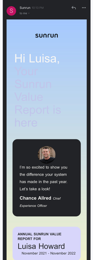
Which turns this…
Into this:
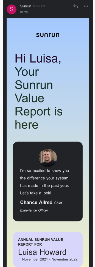
The end result makes a world of difference in readability for anyone using dark mode on their device.
Want to optimize your email communications? Our email and code nerds love a good challenge! Give us a shout at hello@wdgt.co to start the wheels turning.